• #artanddesign - #designblog - Blog

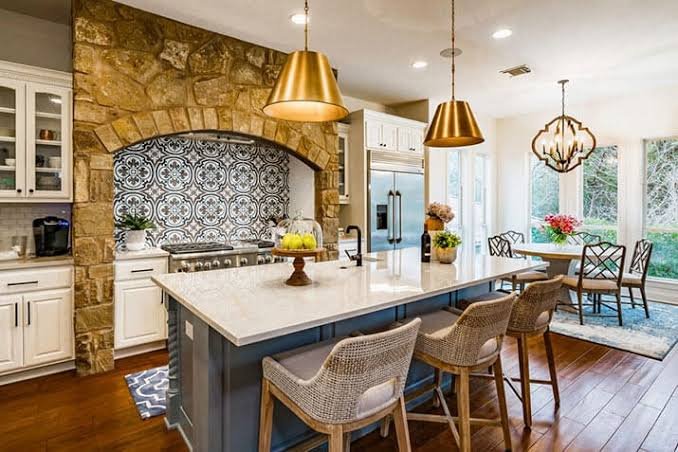
    The Mediterranean Kitchen in Summer: Rustic Elegance and Functional Beauty

    The Mediterranean kitchen is not simply a place to cook—it is a space shaped by ritual, season, and the quiet rhythm of daily life. In summer, it becomes something more: open, sunlit, and deeply connected to the outdoors. Unlike modern kitchens that often prioritize sleekness and concealment, Mediterranean kitchens embrace material honesty, visible function, and lived-in beauty. They are designed to be used, not staged—where preparation, gathering, and conversation unfold seamlessly. Let’s dive into some fundamentals of designing a kitchen with a Mediterranean flair.  A Foundation of Stone, Plaster, and Time At the heart of a Mediterranean kitchen is its…
  • #art - #artanddesign - #artist - #designblog - Blog - cultural

    Impressionism and Summer: Why Light and Leisure Still Inspire Design

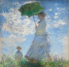
    There is perhaps no artistic movement more intrinsically tied to summer than Impressionism. It is a movement defined not by rigid form or historical grandeur, but by light in motion, fleeting beauty, and the quiet luxury of leisure. In a season where days stretch longer and the sun reshapes every surface it touches, Impressionism feels not just relevant—but essential. For those of us working in art and design, the Impressionists offer more than inspiration; they provide a framework for seeing. A way to interpret space, color, and atmosphere that translates seamlessly from canvas to interior. The Birth of a Summer…

  • #designblog - #designer - Blog

    Designing a Mediterranean-Inspired Summer Room: Texture, Light, and Simplicity

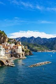
    There is a particular kind of beauty found along the Mediterranean—one that feels both ancient and effortless. It is not polished in the modern sense, nor is it overly styled. Instead, it is layered by time, shaped by climate, and softened by light. To design a Mediterranean-inspired summer room is not to replicate a place, but to interpret a philosophy: simplicity enriched by texture, light as a central feature, and materials that feel inherently connected to the earth. This approach aligns seamlessly with elevated coastal design, offering a more grounded, architectural expression of summer living. The Foundation: Architecture as Atmosphere…

  • #art - #artanddesign - #designblog - #interiordesign

    The Art of Renewal: How Spring Has Inspired Designers and Artists Through History

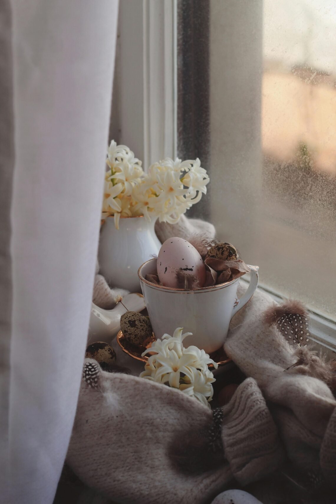
    Introduction: The Season of Becoming There is a quiet transformation that arrives each year—soft at first, then undeniable. Spring does not burst onto the scene; it unfolds. Bud by bud, light by light, it reshapes the world. For centuries, artists have tried to capture this fleeting moment of renewal—the tension between what was and what is about to be. In art, spring is not merely a season. It is a language of rebirth, hope, fragility, and awakening. From mythological allegories to Impressionist gardens, the visual and emotional vocabulary of spring has remained one of the most enduring themes in artistic…

  • #designblog - Blog

    Romanticism Revisited: 7 Reasons Why February Still Belongs to the Romantics

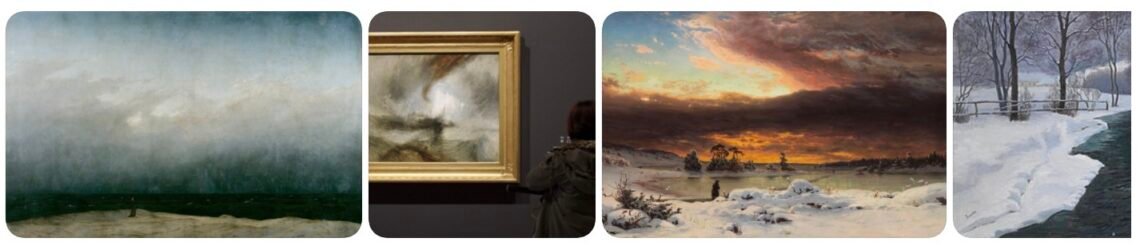
    February is often reduced to a commercialized version of romance—roses, chocolates, and fleeting sentiment. But historically and aesthetically, February belongs to something deeper. It belongs to Romanticism. Not romance in the superficial sense, but the 19th-century movement that elevated emotion, nature, longing, solitude, imagination, and the sublime. In art, literature, and design, Romanticism is not soft—it is expansive. It grapples with awe, melancholy, spiritual intensity, and the human need for transcendence. As winter lingers and daylight subtly stretches, February remains the most Romantic month of the year. Here are seven reasons why. 1. February Is the Season of the Sublime…

  • #designblog - #interiordesign - Blog

    Traditional Design & the Enduring Romance of English Country Style

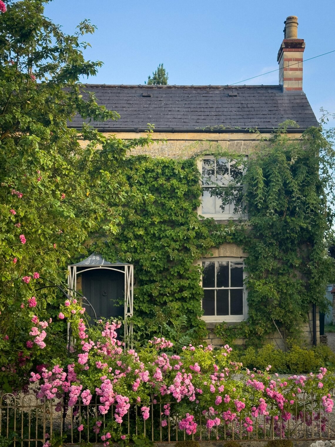
    Traditional design is not merely an aesthetic; it is a philosophy rooted in continuity, craftsmanship, and cultural memory. Among its most evocative expressions is English country style—a look shaped by centuries of landed estates, equestrian life, inherited objects, and a reverence for the patina of time. Few modern designers have interpreted and sustained this tradition with as much conviction and global influence as Ralph Lauren. Through both fashion and interiors, Lauren has crafted a world that feels at once aspirational and deeply familiar, blending aristocratic restraint with lived-in comfort. Understanding Traditional Design Traditional interiors are defined by balance, symmetry, and…

  • #artanddesign - #artist - #designblog - #designer - #interiordesign - Architecture - Blog

    January Interiors: Layering Warmth, Texture, and Light After the Holidays

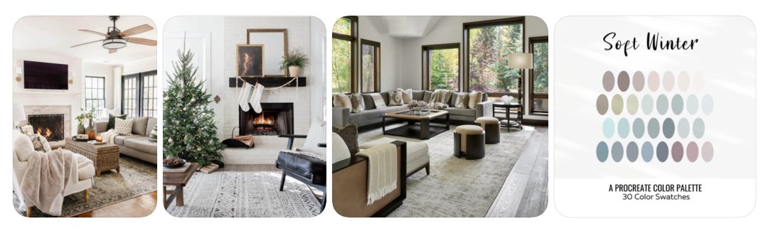
    January is the quiet inhale after December’s long exhale. The ornaments are packed away, the lights dimmed, and what remains is the home itself—its bones, its textures, its ability to hold us through the coldest weeks of the year. This is not a month for dramatic reinvention. January interiors are about refinement, warmth, and intention. About learning how to live well inside the pause. Rather than rushing to replace what the holidays have taken away, winter asks us to layer like the snow outside the window —to soften rooms, deepen comfort, and let light move gently through our spaces. Designing for…

  • #artanddesign - #designblog - #interiordesign

    Pantone’s 2026 Color of the Year: Cloud Dancer — Creating a Calm Environment in a Noisy World

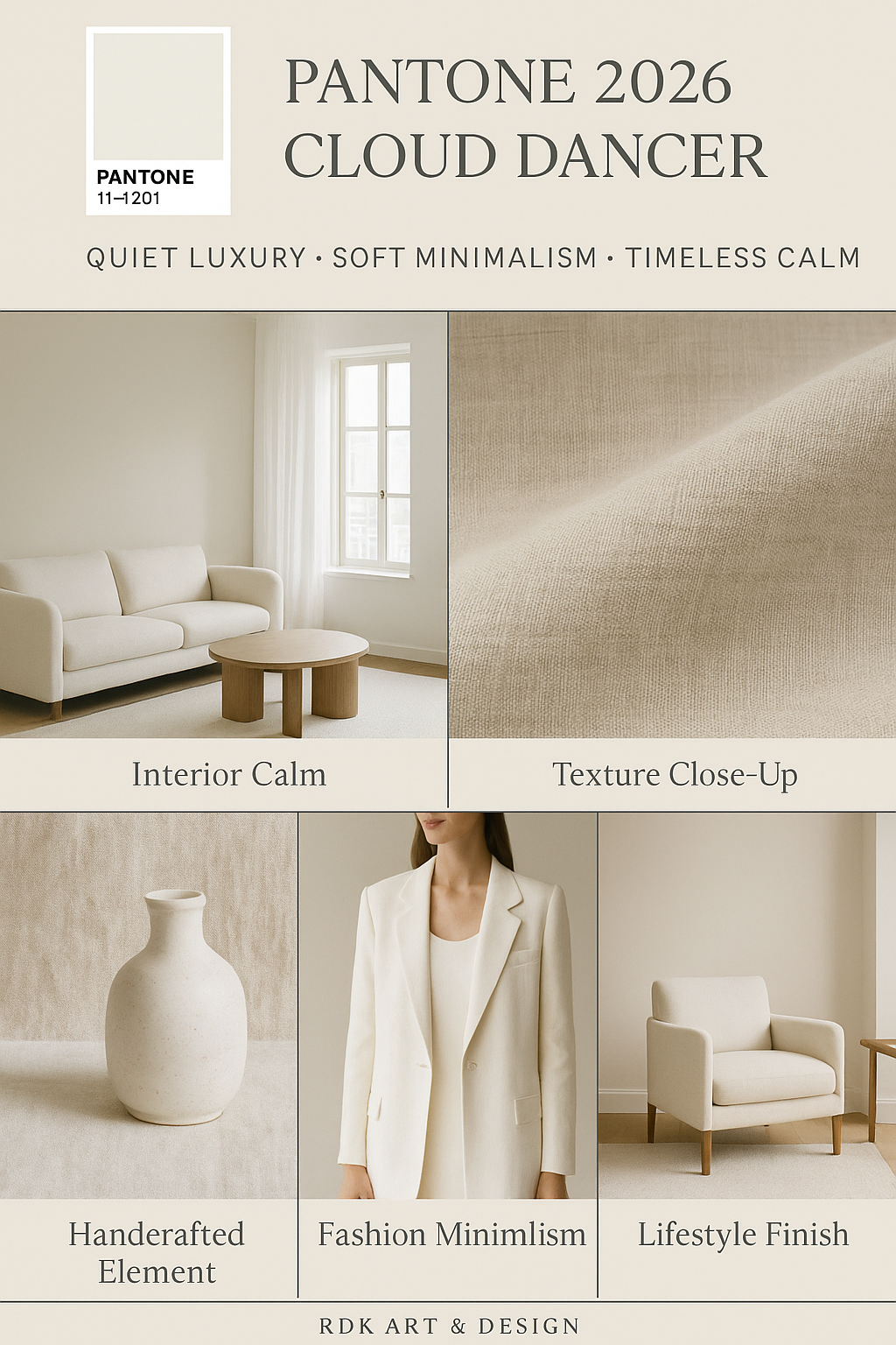
    Every year since 1999, the Pantone Color Institute has selected a color intended to reflect the mood, aspirations, and cultural undercurrents of the year ahead. From bold hues like Viva Magenta to comforting tones like Mocha Mousse, these colors have shaped everything from runway collections to interior design palettes. For 2026, Pantone has made a surprising and deeply symbolic choice: Cloud Dancer, a soft, ethereal shade of white.   What Is Cloud Dancer? Cloud Dancer — officially PANTONE 11-4201 — is described by Pantone as a “lofty white neutral” with an airy quality that acts like a “whisper of calm and peace in a noisy world.” It’s not stark or clinical, but…

  • #artanddesign - #designblog - #interiordesign

    The Evolution of Autumn Color Palettes in Interior Design

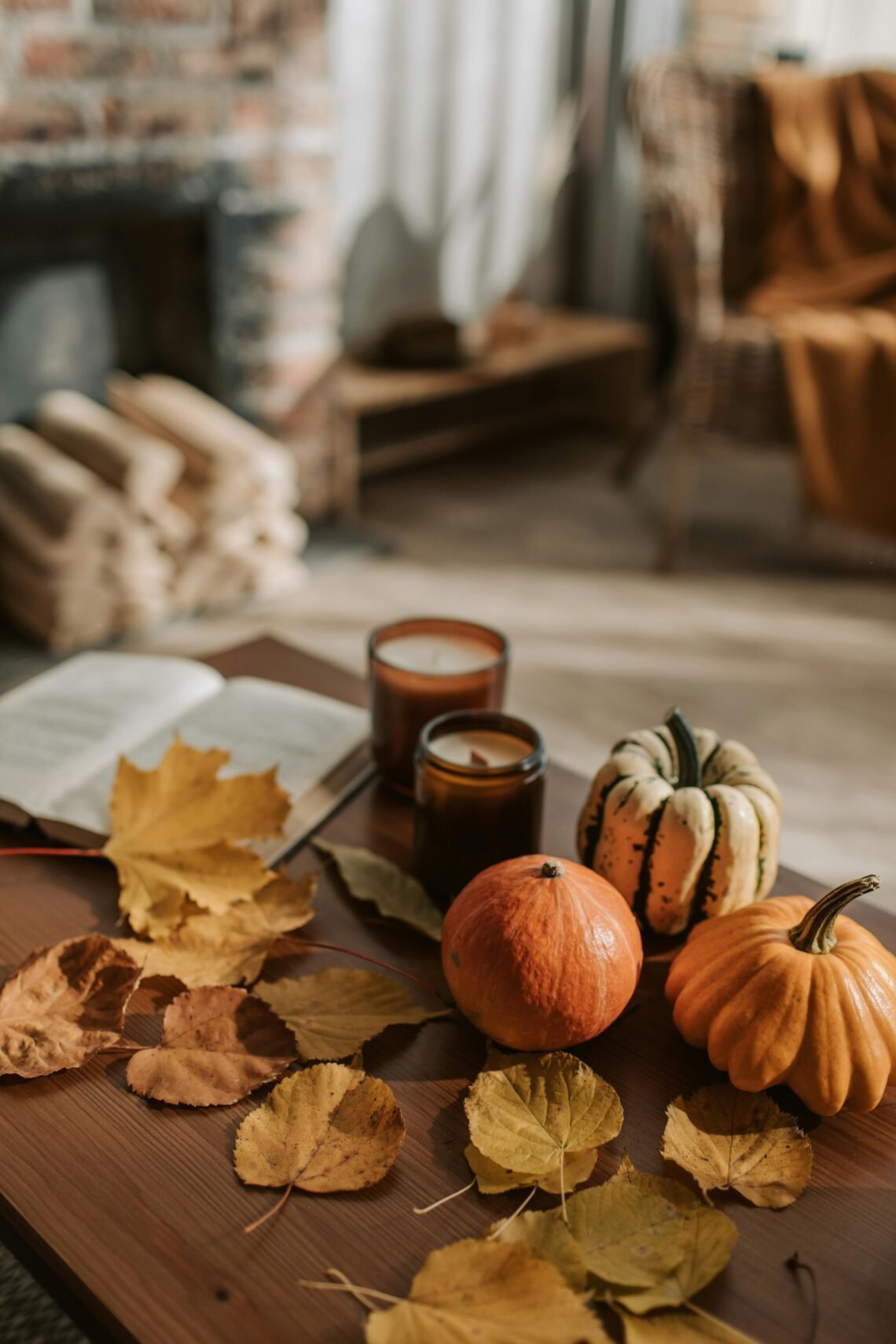
    How Designers Use Rust, Ochre, Burgundy & Moss Green — And the Art History Behind Them Every autumn, interior design undergoes a quiet transformation. Soft summer hues give way to richer, moodier tones that echo the changing landscape outside. Rust, ochre, burgundy, and moss green emerge like seasonal old friends, each carrying centuries of artistic tradition and emotional resonance. These colors are not merely trendy—they are steeped in art history, symbolism, and cultural meaning that designers continue to draw upon today. The Natural Roots of Autumn’s Palette Autumn’s colors begin with nature’s own transformation—fallen leaves, fading fields of grain, and…

  • #artanddesign - #designblog - #designer - #interiordesign

    The Art of Tablescapes: Designing a Meaningful Thanksgiving Table — Elegance, Beauty & Food Presentation

    A Thanksgiving table is more than a place to gather—it is a visual celebration of gratitude, abundance, and connection. A well-designed tablescape has the power to set the emotional tone for the entire holiday, transforming a simple meal into a cherished memory. Whether you prefer the layered richness of classical design or the quiet refinement of minimalism, a thoughtful approach to color, texture, and composition makes the Thanksgiving table feel truly meaningful. Classical Thanksgiving Tablescapes: Rich, Layered, and Timeless Classical tablescapes draw inspiration from European historic dining traditions—ornate linens, gilded accents, natural greenery, and artful layering. This style embraces abundance…