• #artanddesign - #designblog - #interiordesign

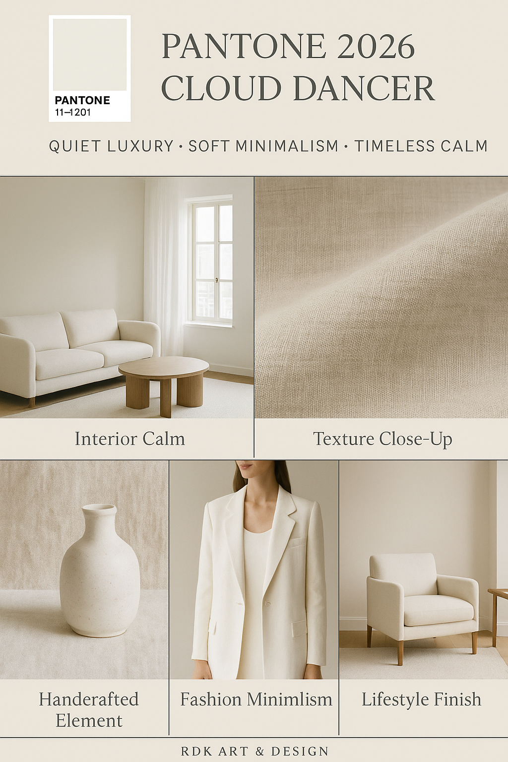
    Pantone’s 2026 Color of the Year: Cloud Dancer — Creating a Calm Environment in a Noisy World

    Every year since 1999, the Pantone Color Institute has selected a color intended to reflect the mood, aspirations, and cultural undercurrents of the year ahead. From bold hues like Viva Magenta to comforting tones like Mocha Mousse, these colors have shaped everything from runway collections to interior design palettes. For 2026, Pantone has made a surprising and deeply symbolic choice: Cloud Dancer, a soft, ethereal shade of white.   What Is Cloud Dancer? Cloud Dancer — officially PANTONE 11-4201 — is described by Pantone as a “lofty white neutral” with an airy quality that acts like a “whisper of calm and peace in a noisy world.” It’s not stark or clinical, but…
  • #artanddesign - #designblog - #interiordesign

    Choosing Colors

    Choosing your color scheme Color theory is quite a complex concept. I wanted to do some simplification and focusing on interiors to make it easier to understand and which can help chose a color scheme for your home.  My color wheel The basics Google said 7 but there are 8 different color schemes. They are achromatic, monochromatic, analogous, complementary, split complementary, triadic, square and tetradic. The 3 at the end of the list are more appropriate for other art and design projects such as advertising. Typically for interiors we use the achromatic, monochromatic, complementary and analogous color suggestions.  Achromatic color…

  • #designblog - #interiordesign

    Color in design: Blue and White

    The use of color is fundamental to interior design for both residential and commercial spaces. There is so much science that goes into pigments and the naturally occurring color of the natural world. Of course, the history of the pigments for paint for the artist is just as fascinating and the history of porcelain whichContinue reading "Color in design: Blue and White"